

 I recently got this question from one of our readers (Berniece):
“Hey Sonny, any suggestions for picking the right frame? I have a picture from my wedding that I love, but the frame sort of hides it. It definitely is not the right frame for the picture. But at the same time, the frame is cool. I want to use it. Any suggestions on picking the right frame for a picture and the right picture for a frame?”
A great question and the answers really span choices based on aesthetics. There is a vast amount of selection and variety when it comes to framing your photos and just like choices of clothing, jewelry or interior design, beauty can truly be in the eye of the beholder. So there aren’t any absolutes, but there are guidelines. Let’s go over a few.
Consider the subject(s) of the photo.
This may seem obvious, but many people skip this step. Instead they’ll look for an appealing frame that will fit the picture and call it a day. Sometimes a horrible mismatch can happen and the photo will need to be reframed. Instead, evaluate the photo and spend a little time to intentionally think about what mood you’d like to convey to a viewer as they look at the image. Is it a fun family picture? Is it a flattering headshot? Is it a dramatic sunset with an ocean vista? Is it a beloved pet or a treasured classic car? A classic black and white photo would be out of place in a colorful plastic frame and a picture of a kids birthday party wouldn’t match an ornate burnished gold frame. Considering the subject can really make a difference.
 Consider the colors of the image.
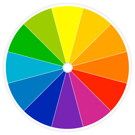
If you’re going to use a mat in the frame, find the primary color in the photo and see if you can contrast it with a complementary color. Take a look at the color wheel in it’s most basic form. Complementary colors are opposite of each other. Purple and yellow, red and green, blue and orange. Another choice that can work is to choose mat colors that reflect dominant or highlight colors in the photo. A dress, a flower, the color of someone’s jacket. Does the photo have more earth tones or bright color tones? Would the photo be best complimented by a simple, black formal frame? Again, these are just guidelines but, depending on the situation, you can really make your image stand out if you choose your mat color intentionally.
If you don’t use a mat, the choice of your frame is even more important. Once again, think of the mood you’d like to convey.
Consider the texture of the frame.
Would the photo benefit from a stressed, rustic and gritty type of frame or a more polished and refined look. Should you choose a smooth and simple finish or would a more ornate, fancy and stylized frame be better suited? Antique, wood and “stressed” frames might be ideal for older pictures to convey a sense of nostalgia, while polished wood, plastic and shiny metal could work well with contemporary prints or modern photos.
Consider the placement of the framed photo.
Where do you plan to hang or place the photo? Will it be in a darker living room or brighter kitchen? Will it be on a white fireplace mantle or on a rustic bookshelf? Will it be placed near an elegant grand piano or in a brightly lit loft or common area?
Balance and Proportion
Again, an aesthetic decision dependent on particular tastes. Rules of convention would suggest that your mat and frame are appropriately proportioned to the size of the image, but artistic expression doesn’t always follow the rules of convention. See some of the examples below. Some of these may or may not suit your style, but I wanted you to see what might be done to give you some ideas to work with.
Consider: Perhaps there is no frame.
I’ve printed images for clients on full gallery wrapped canvas where the images stretch all the way (actually over) the edge in a full bleed. Some photos really benefit from this stark and naked display style, while others really shine and look their best cradled in an appealing frame.
Perhaps the most important, overarching question to consider:
How much does the frame play a part in the delivery? Does it pull back and highlight the image itself or is it an important and critical component to the overall “package”? In any case it should never detract or distract from the mood or impact that you’d like your photo to convey.
After all of your efforts of capturing the image with your camera then selecting and editing it to be seen, choosing an appropriate frame and displaying it are essential parts to tie everything together for others to admire and enjoy.
10 Compact cameras reviewed
Very cool. Thank you so much!
You’re most welcome!
Great info. Very helpful. Thanks 🙂
You are most welcome!
Nice job on framing. Color tips were spot on. Good job
Thanks Bill. Hope they help!
Great tips and things to think about. Any good ideas on how to line up frames so they are evenly spaced, or the same height would be helpful. I’ve had issues with frames that have the wire on the back, and getting them to be aligned.
Hey Phil, I’m not the expert in hanging, but here are some good tips at these sites: http://j.mp/1vn8B2h, http://j.mp/1vn8EuQ, http://j.mp/1vn8K5U. Hope those help.